crella
V2EX  ›  问与答

win7 使用非微软系字体,字体发虚严重

  •  
  •   crella · Apr 12, 2020 · 451 views
    This topic created in 2227 days ago, the information mentioned may be changed or developed.

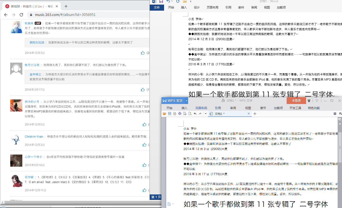
    在 win7 下,看惯了微软雅黑,扁扁的不舒服,于是换了苹方黑体和冬青黑体,但是都有发虚问题。

    发虚程度(按严重->较不严重排序):wps2016>chrome81>word2013 。

    (opera67 与 chrome 的显示效果差不多)

    冬青黑体的版本是: 冬青黑体简体中文 W3 version 3.10

    opentype layout truetype outlines 。

    不想折腾 mactype,请问大概是哪里设置错误了呢?

    chrome 用微软雅黑字体:

    chrome-msyh.png

    chrome 用冬青黑体:

    chrome-dqht.png

    三个程序用冬青黑体的显示效果比较:

    chrome-word2013-wps2016-dqht.png

    No Comments Yet
    About   ·   Help   ·   Advertise   ·   Blog   ·   API   ·   FAQ   ·   Solana   ·   3514 Online   Highest 6679   ·     Select Language
    创意工作者们的社区
    World is powered by solitude
    VERSION: 3.9.8.5 · 52ms · UTC 10:32 · PVG 18:32 · LAX 03:32 · JFK 06:32
    ♥ Do have faith in what you're doing.